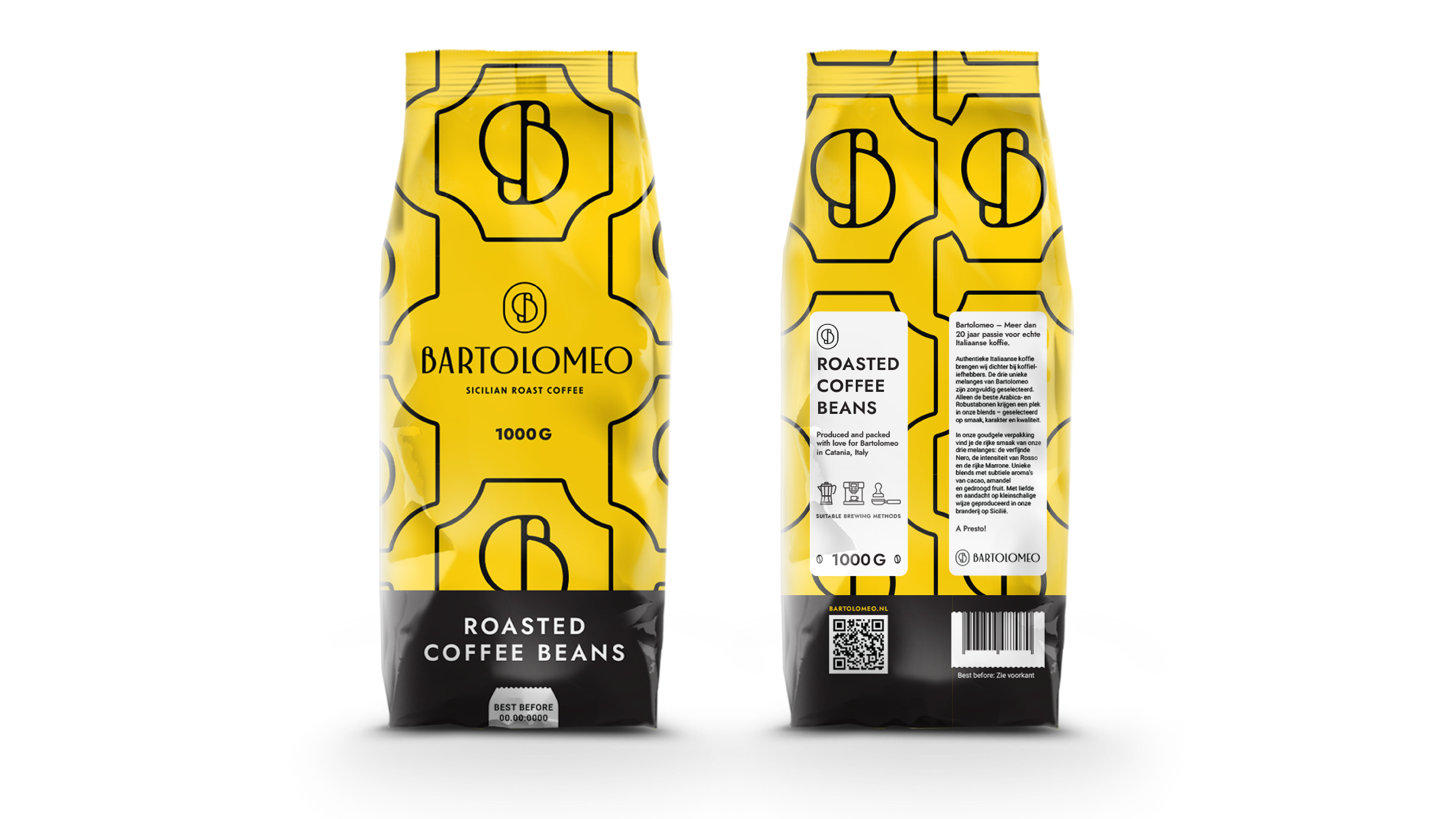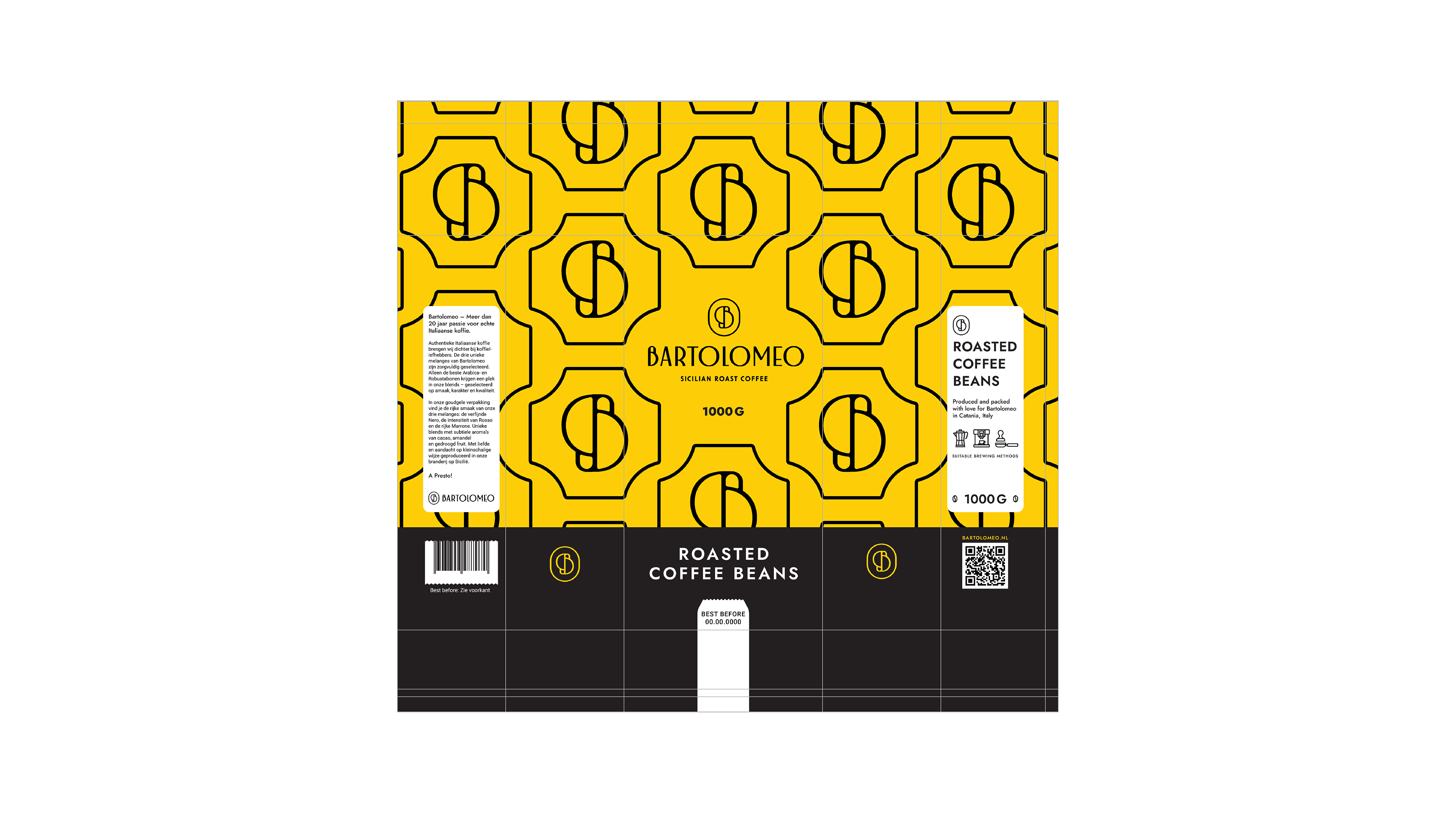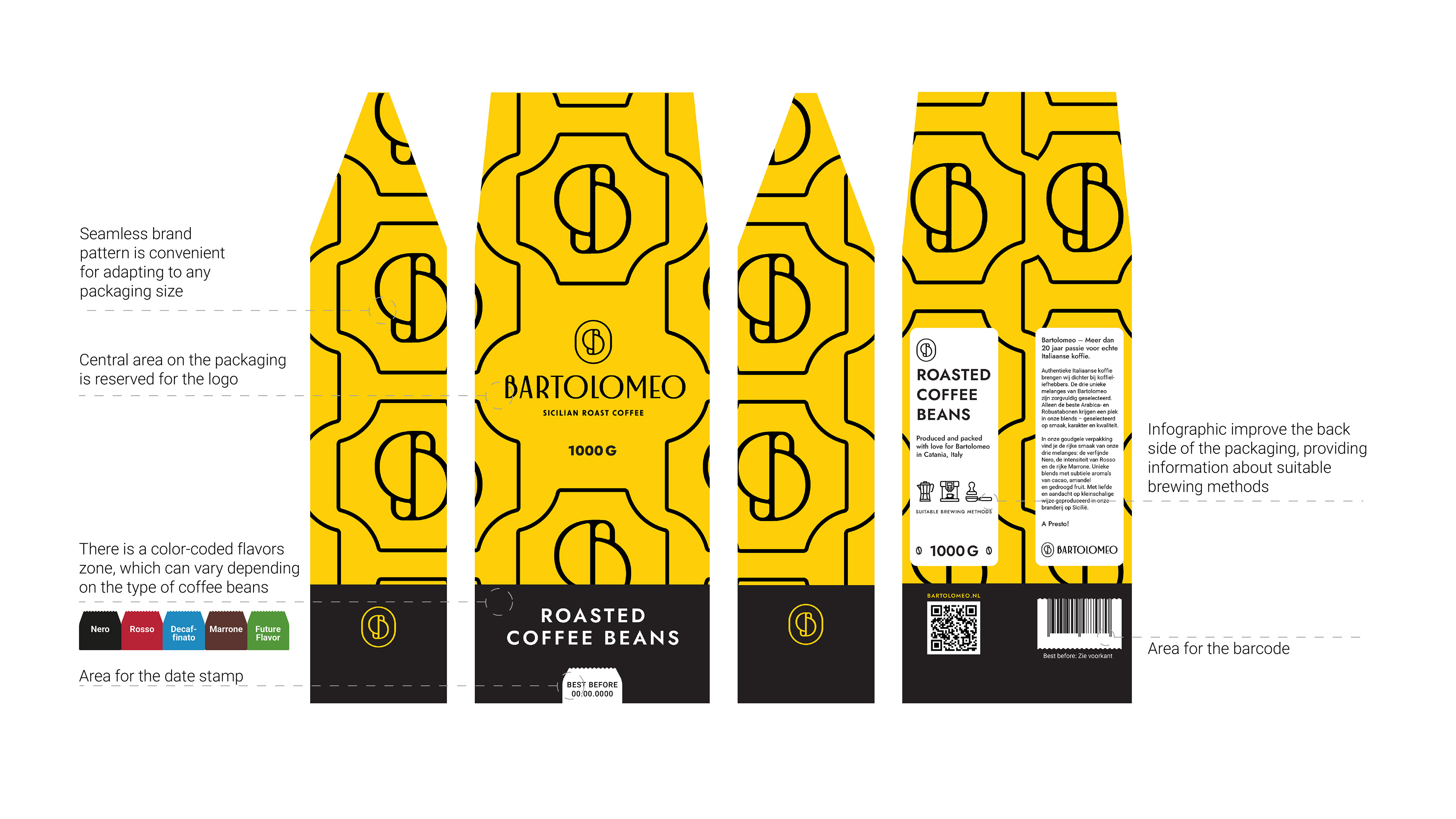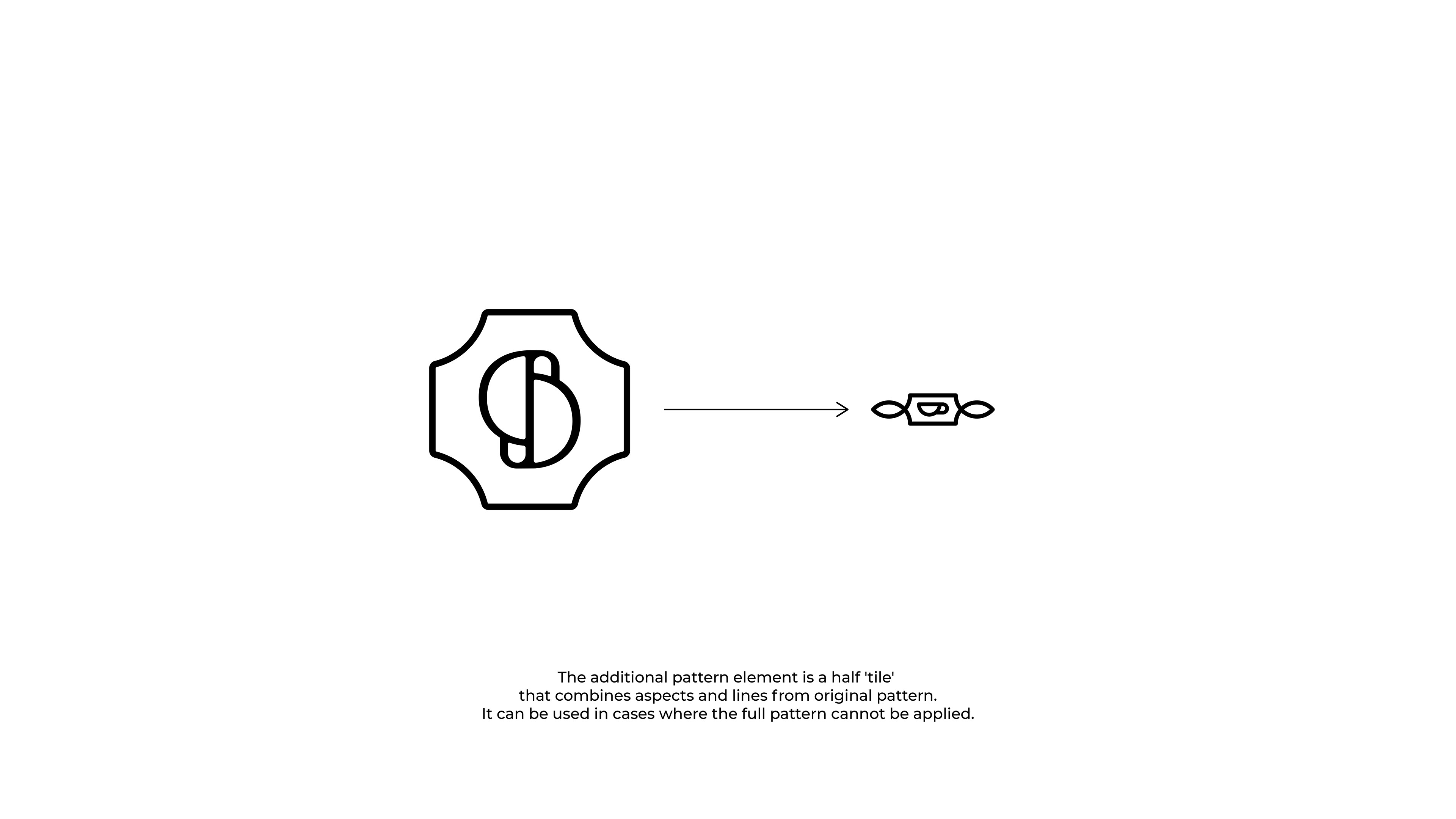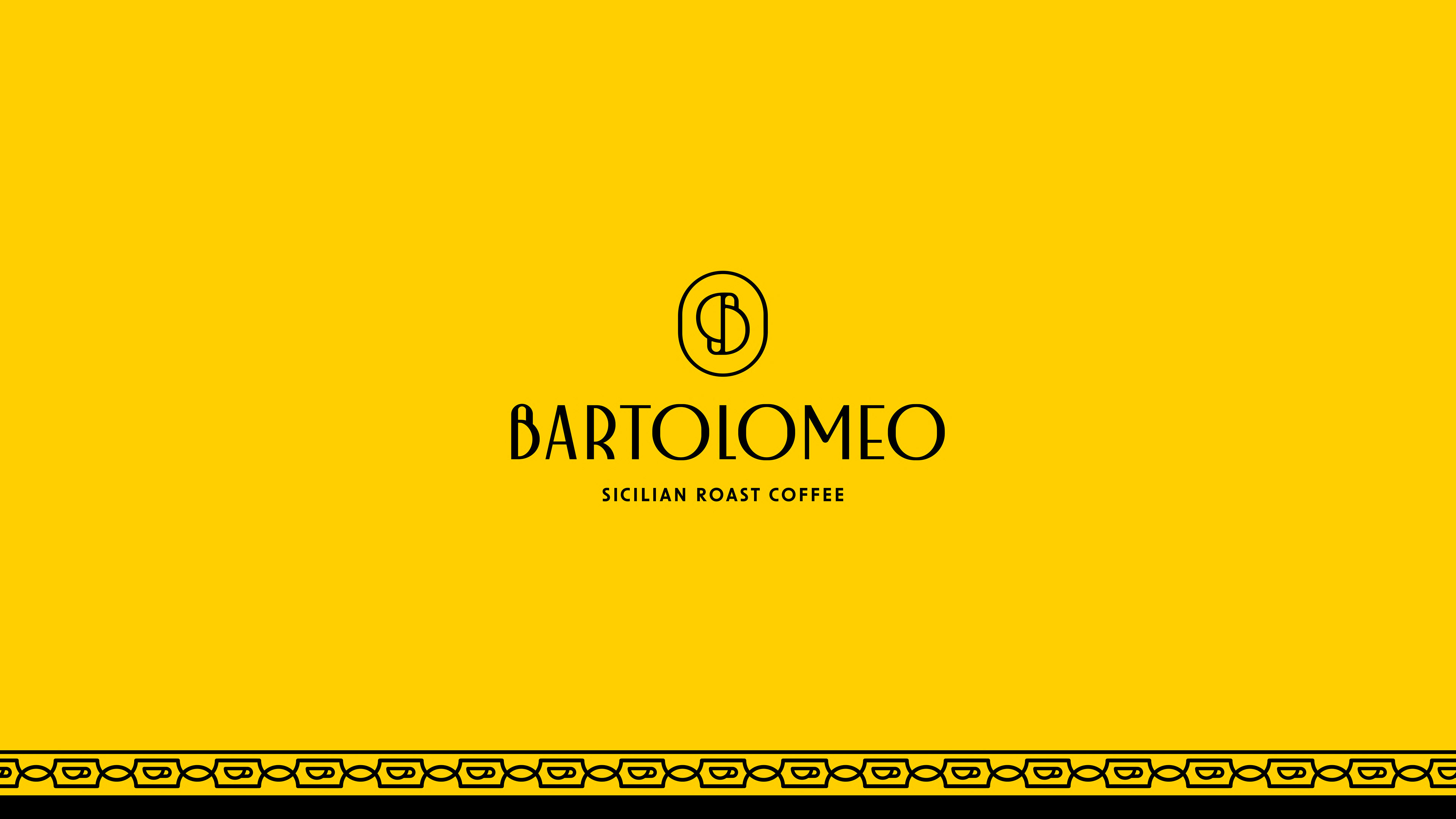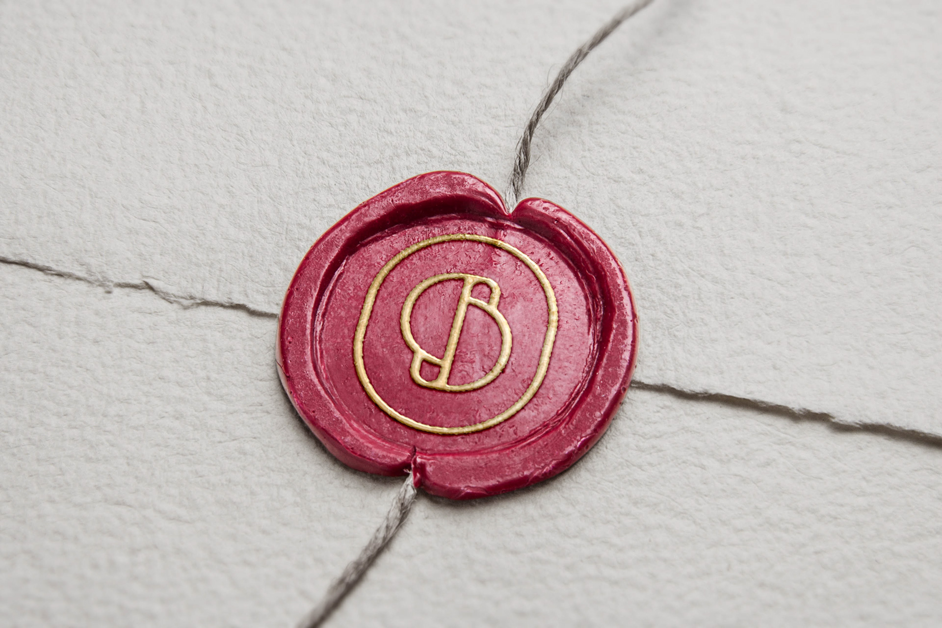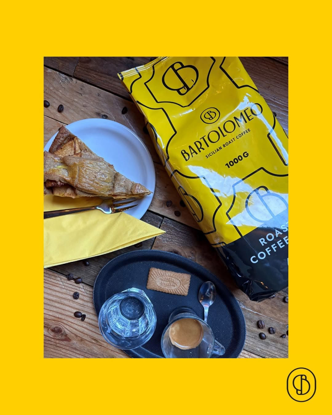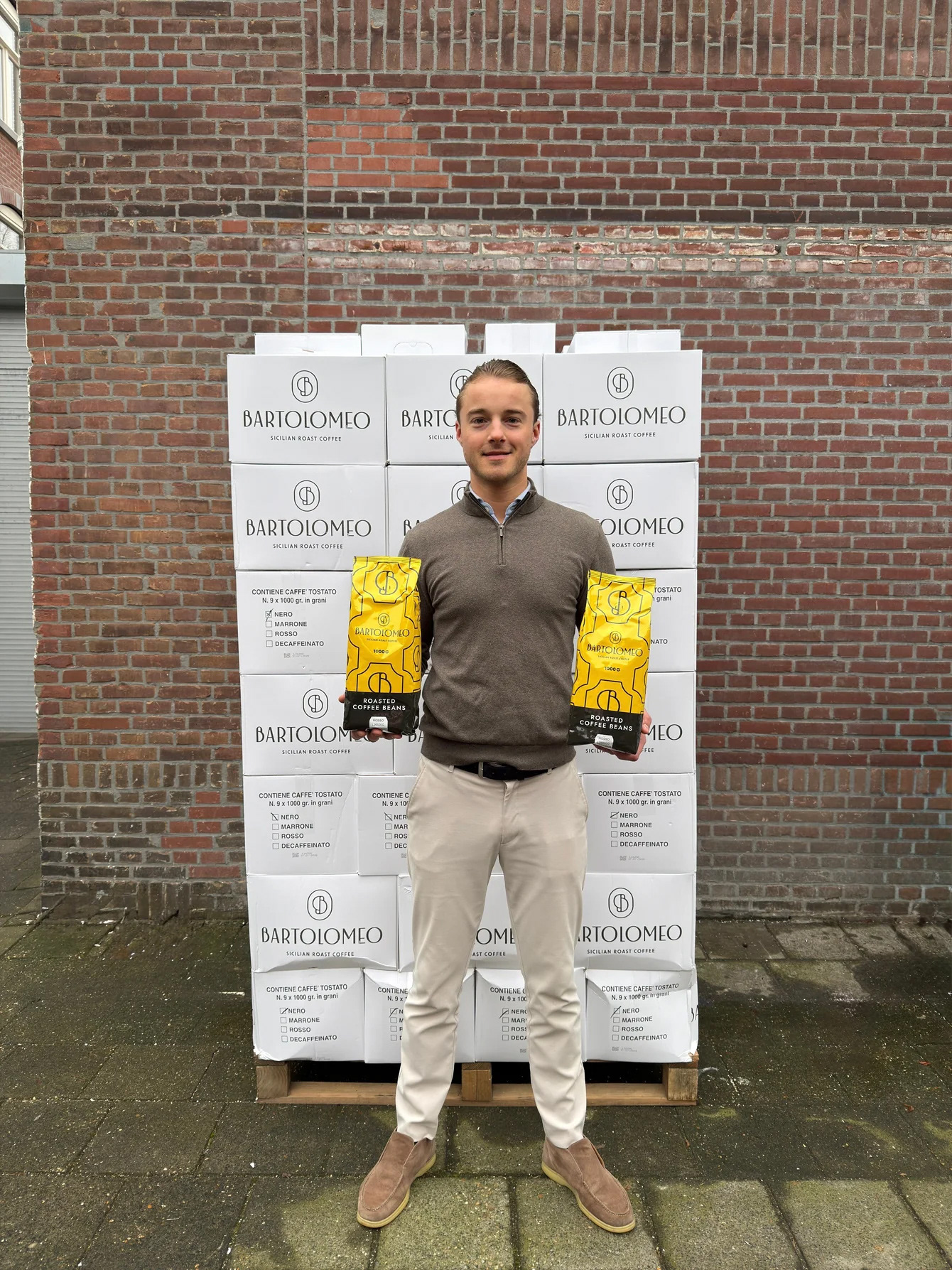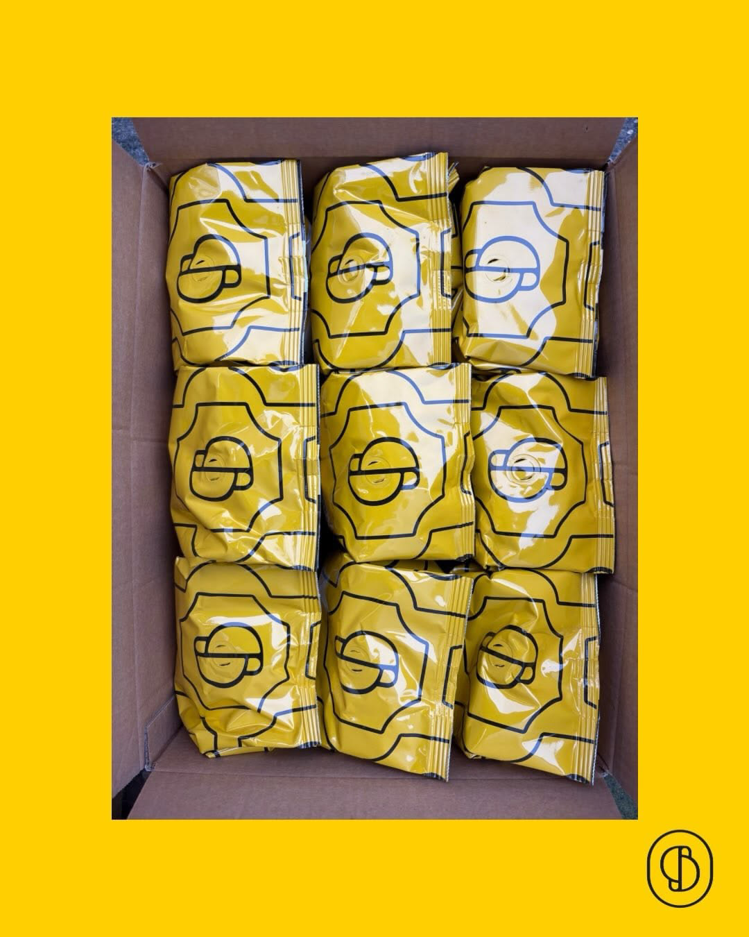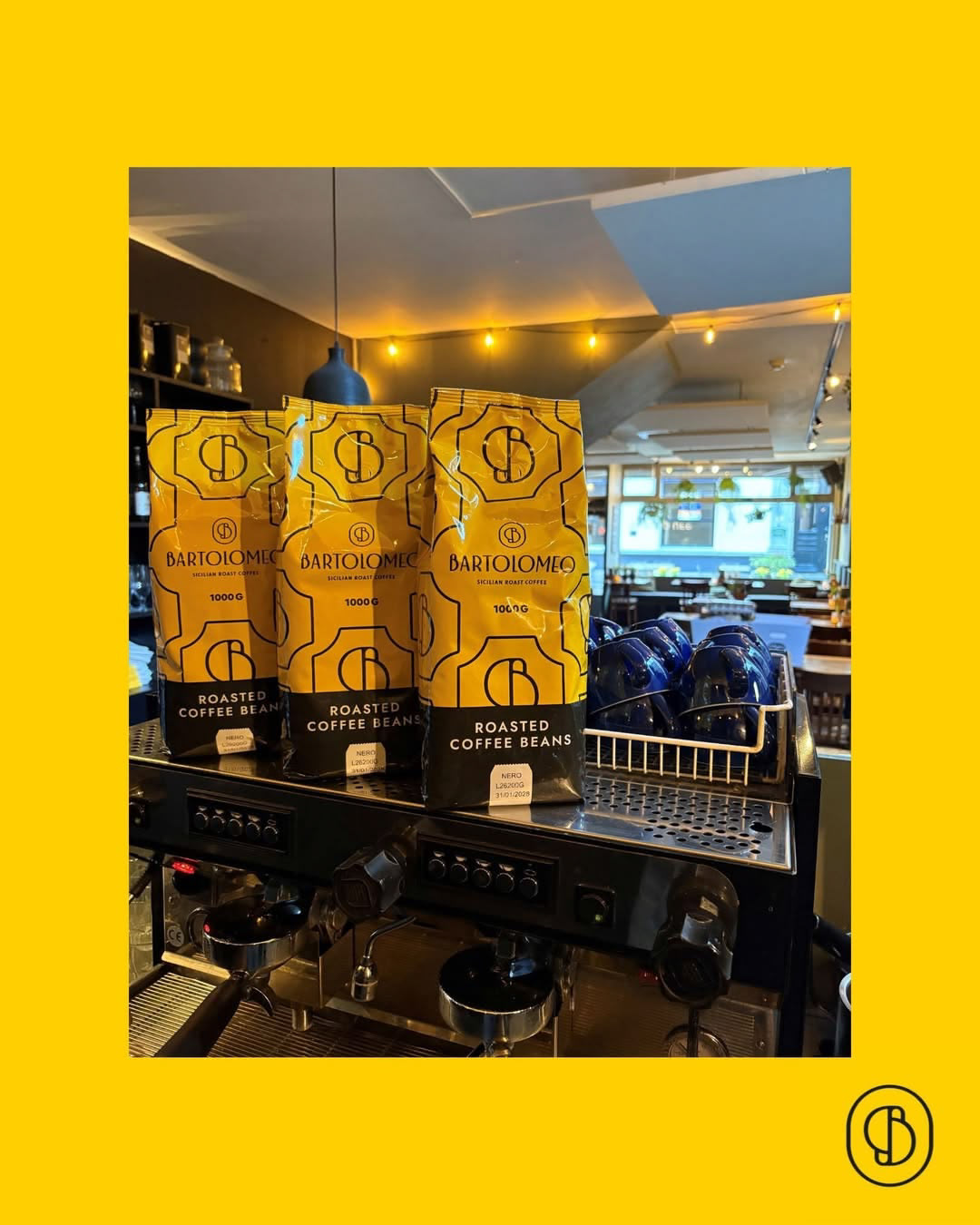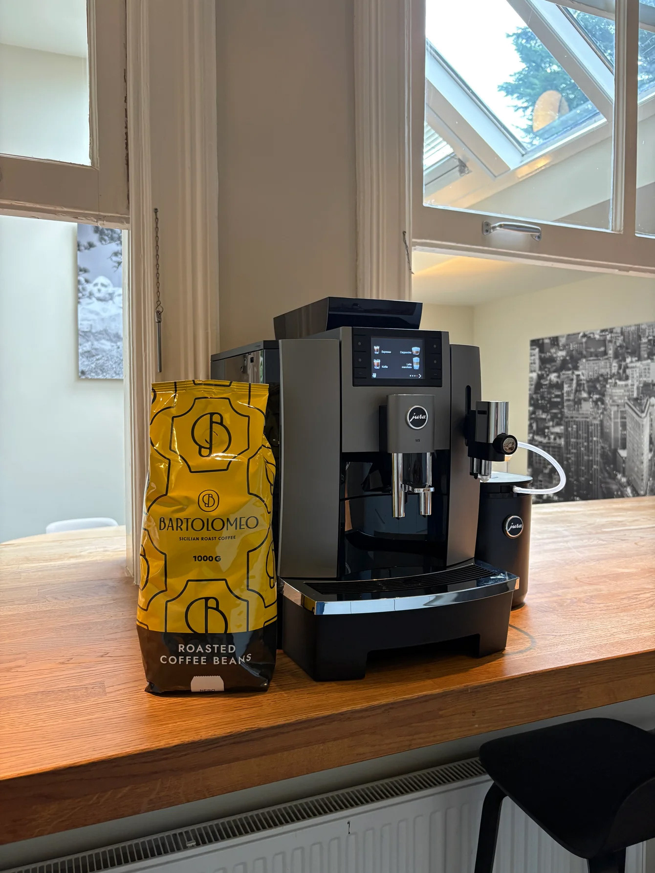

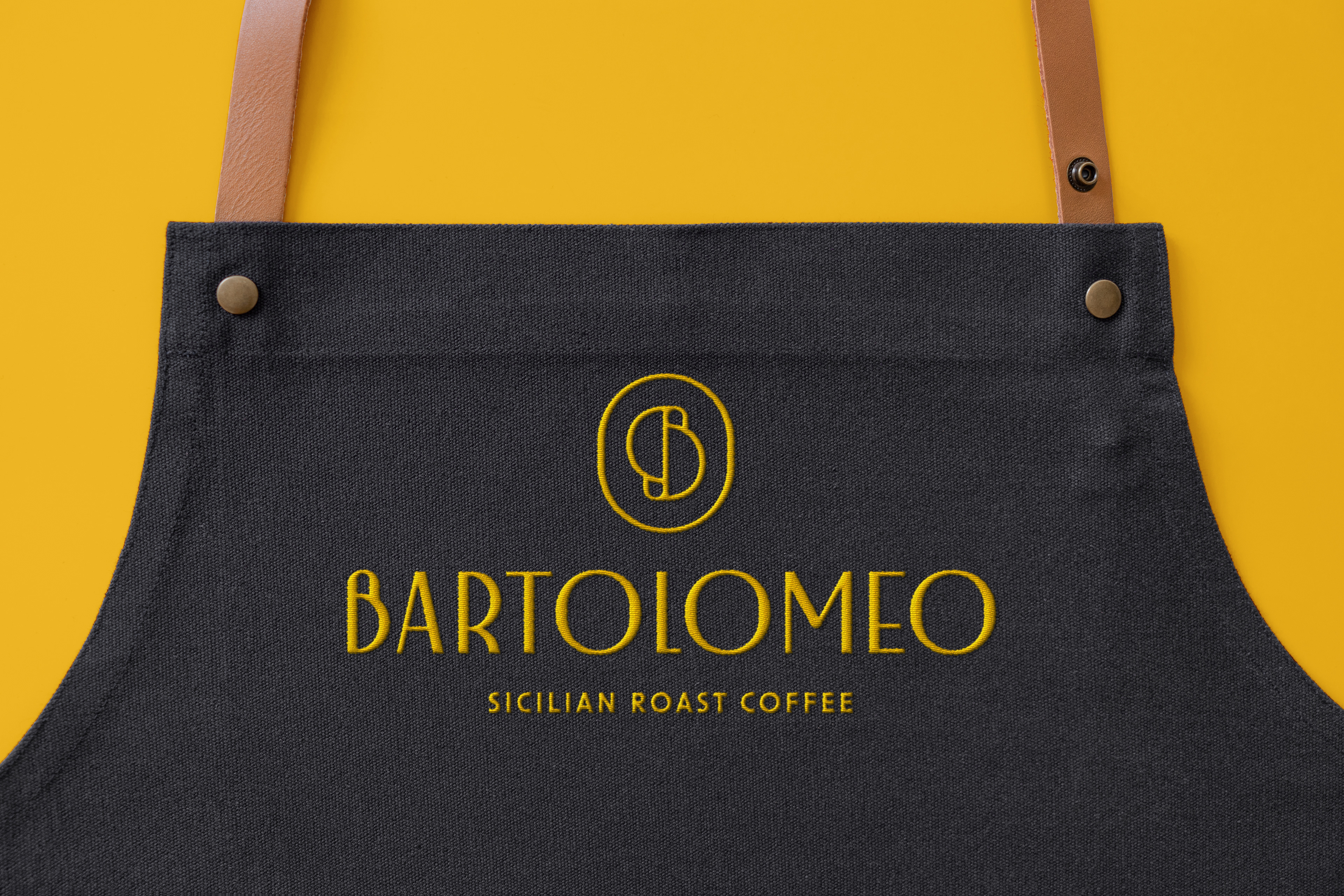
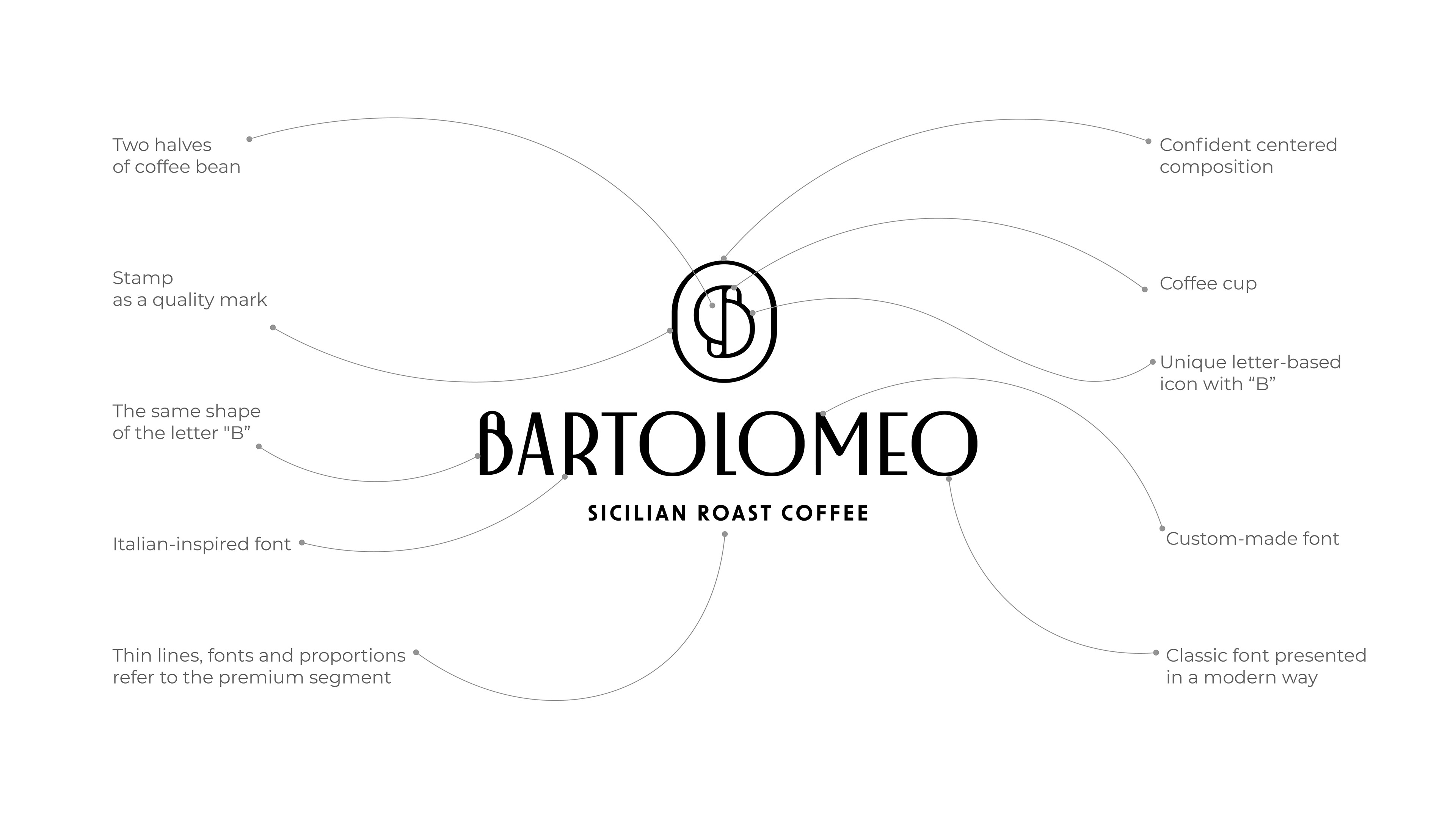
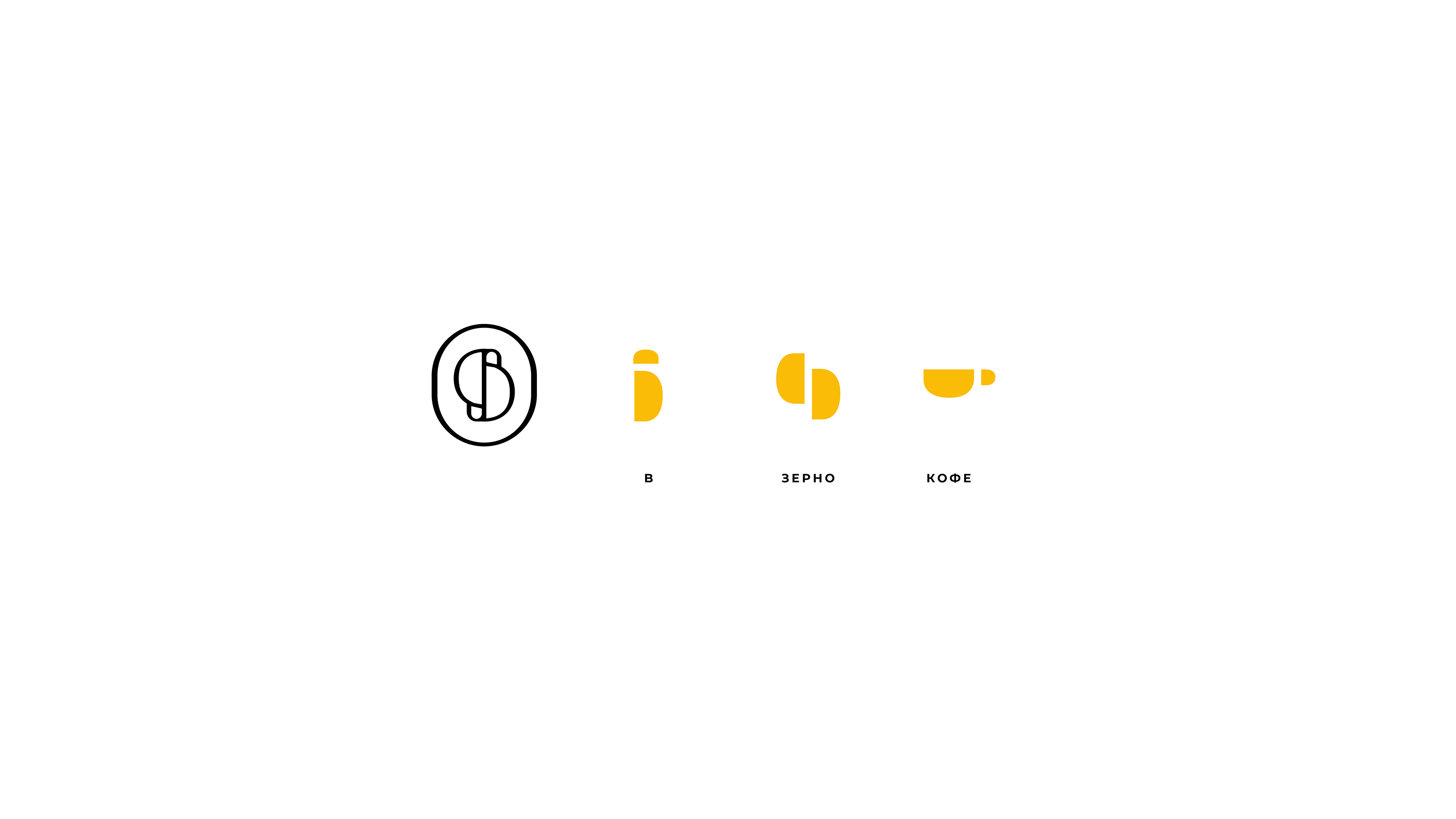
This logo concept draws inspiration from Italian typography of the 1930-1960s, particularly the elegant, bold lettering seen in Italian shops and signage of the era. The typeface is a customized Art Deco-inspired font, balancing elegance and modernity. The font is based on a dramatic, contemporary font family, tailored with reduced contrast and unique letter shapes to reflect the icon idea. The icon features the double letter "B" represent two halves of a coffee bean and one half of the icon remind a coffee cup, reflect connection to coffee culture. The overall icon’s design resembles a stamp, serving as a mark of high quality product. The shape of the letter "B" in both the icon and the font creates a strong visual connection, gives a possibility to use icon and font separatley. Thin lines, proportions and colors gives a premium feel. The confident, centered composition highlight the sophisticated and traditional brand. One the simple shape from the icon becomes a playful pattern, with a slightly chaotic rhythm but maintain straight geometric positioning. This pattern adds an element of creativity and dynamism to the brand identity, perfect for packaging, backgrounds and fit good with a photo.